Thursday, December 31, 2009

Chaotic Banners and Packaging

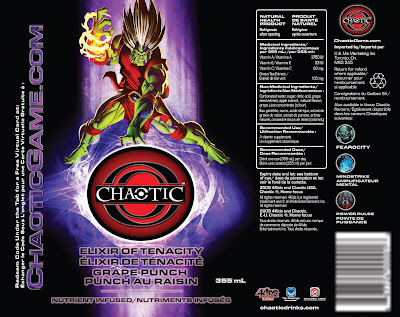
Chaotic packaging

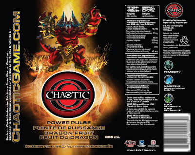
Chaotic packaging

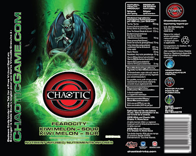
Chaotic packaging

Chaotic banners

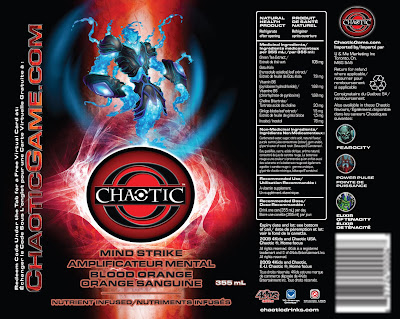
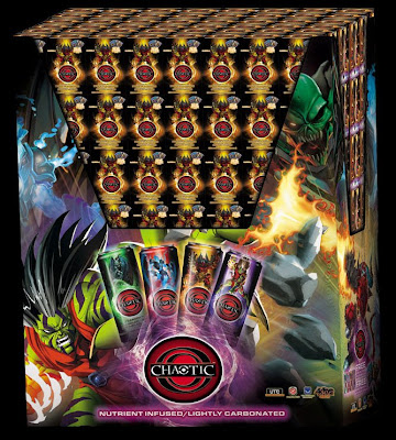
With the can design in place I was asked to develop additional packaging for the product, this included a 4 pack case, and a palette wrap. I was also asked to produce banners and a barrel wrap design. The images are of the case, the banners and both the flat and the simulated 3-D palette wrap.

Wednesday, December 30, 2009

Chaotic Beverages

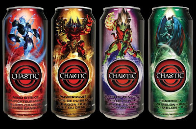
Chaotic cans

Chaotic packaging

Chaotic packaging

Chaotic packaging

Chaotic packaging

A new product is being introduced to Canadian consumers. It's already in the United States and the distributors wanted the cans to look different than their U.S. counterparts. The elements provided were the key art for the character cards, the drink names and the Chaotic logo.

Rather than showing the environment the characters occupy on the cards, I decided to cut them out and have them shown at the stage of transporting into the world of Chaotic with a glowing logo beneath them. The effect is quite striking when printed against a rich black background.

Tuesday, December 29, 2009

Fight Banner

Fight Banner

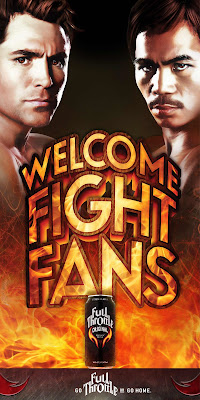
This was a banner created for pubs in the States that were going to be showing the De La Hoya-Pacquiao fight. The banners were created to highlight Full Throttle as a sponsor and they had to reflect the branding of that product.

The key art for all of the previous materials/advertisements for the fight were very tech looking and blue in tone. The fireball/explosion helped distinguish the banner from all previous pieces and it unified the existing key art elements with the product, plus it helped give the piece a nice energy.

Monday, December 28, 2009

Australian Legend


Australian Legend

When my first attempt on this project didn't go over well (see FAIR DINKUM and FIGJAM) I was asked to create a few more concepts and some swag to go along with the design. For this one I opted to focus on Ned Kelley (a true Australian Legend) or someone just like him, and I used the tag line that was created previously – "Break Out The Legend".

I put in Lorem Ipsum to show copy placement (I felt it should be creatively written in such a way as to sing the praises of the outlaw and somehow tie it into the wine). And then I created a bottle hanger (that would share some of the same copy) and, even though it would not be used on this product, a bottle opener made to resemble an old skeleton key.

The verdict is still out on this one, but I like it.

Sunday, December 27, 2009

W J Calendar

W J Calendar

For this piece I acted, primarily, as Creative Director (I got to boss people around). After a couple of brainstorming meetings with the Art Directors we determined that the main thing we wanted this piece to be, to whomever received it, was fun. We wanted the person to enjoy each month and maybe they would even keep that favorite as a piece of art for their cubicle.

I wanted each month to feature a local illustrator and the calendar would help promote them as well as the company. It would also foster good will amongst the design and illustration community so that in the future, when we needed to create another calendar, we could utilize a new group with different illustration styles. For the final artwork we used two illustrators who had a few different styles, plus the two Art Directors and myself. The end result was a piece everyone was happy with.

Saturday, December 26, 2009

Fairy Tale Fiascos

Fairy Tale Fiascos

I was asked to develop a poster for the 2008 production for Alberta Dance Theatre, titled Fairy Tale Fiascos. It was a series of fractured fairy tales much like "the True Story of the 3 Little Pigs" or "the Stinky Cheese Man" so there was a lot of fun to be had. The key thing was that it had to look fun and appeal to their demographic.

When I presented the first round of concepts it seemed clear to me that I was over-complicating things so while we looked at the first concepts we started to talk about the fractured fairy tales that were to inhabit the performance.

I kept going back, in my mind, to the fractured fairy tales from the Rocky and Bullwinkle show and how the Fairy Godmother was crushed in the pages of the book. This led to the idea of the wicked witch from Oz being crushed under the weight of a book, with only her ruby slippers and striped stockings exposed. The client loved the idea and requested some additional elements be added to show context for the scene.

When all was said and done, though, it was apparent to me that as a poster it would work best if it was as simple as possible, so setting disappeared, as did extra characters, and the book became the only element floating in a happy sea of blue.

The finishing touch was adding a spot foil to the shoes (which doesn't translate very well here) to make them look more like the ruby slippers of the Wicked Witch. The end result is a poster I'm quite proud of.
Thursday, December 24, 2009

Terminator: The Sarah Connor Chronicles

Terminator: The Sarah Connor Chronicles

Terminator: The Sarah Connor Chronicles

Terminator: The Sarah Connor Chronicles

Terminator: The Sarah Connor Chronicles

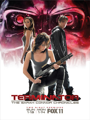
20th Century Fox had a contest. I couldn't enter because it was only open to citizens of the U.S.A. so I downloaded the assets they provided, designed a series of posters and entered anyway.

I never heard from Fox and I have since given up hope of hearing from them. Especially since the series has now been canceled. But regardless, it was fun to do.

(images copyright 20th Century Fox)

Wednesday, December 23, 2009

The Assassination of Jesse James by the Coward Robert Ford

The Assassination of Jesse James by the Coward Robert Ford

I really want to design key art for films, so any chance I get, I give it a go. I liked this movie a lot and I saw a lecture by the photographer, Kimberly French, and was inspired. So I gathered up some images and developed this poster.

It's actually quite a literal interpretation of the events if you ask me. The Robert Ford character is lurking about in the shadow of the iconic American outlaw behind his back. The top of Jesse's head is gone (attempt at foreshadowing). I know distributors would not want to show just half of Brad Pitt's head because that just doesn't sell a movie, I guess, but I wanted to do something different with the images and not make it a floating head poster.

(images copyright Warner Brothers Pictures)

Tuesday, December 22, 2009

A Hard Day's Night

A Hard Day's Night

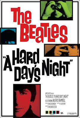
This is one of my favorite movies. I have been a Beatles fan for quite some time and I had been sketching out some poster ideas for awhile, on and off, and I finally decided on a direction I was happy with.

It retains the flavor of the original yet it feels contemporary. I wanted fun images (aside from the Ringo shot which comes across as a little serious - but I liked the look of it). I wanted it to have a sense of hierarchy as well, since Ringo has a little more screen time than John, Paul or George I wanted his photo to be larger.

(images copyright Miramax)

Monday, December 21, 2009

Coke: On Par...

Coke: On Par...

The ad was to appear in a golf publication. Coke wanted their brand properly represented but the ad didn't have to use Coke Red as a dominant element. I was given a sketch of what was wanted and then asked to come up with something else if I had the time.

I came up with this concept and I presented it, along with the client's requested piece, to the Account Coordinator who "didn't get it". They saw the bottle, they saw the golf course, they saw the sand trap but they still "didn't get it." They felt it looked a little too abstract. So the AC asked for other golf course shots.

I sent along what I could find and I fought for this one. I fought for it because I felt the idea was strong enough, and the angle of this photo (once properly manipulated to have a specific green shape) was the right angle to go with. The AC reluctantly agreed.

When the client saw it they loved it and it was published (it even ran again with another golf related headline).

Sunday, December 20, 2009

Coke/Disney

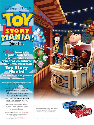
Toy Story Mania!

Coca-Cola

Here are two pieces where Disney did a cross promotion with Coke. Disney supplied the images and I added the odd touch or two and then, after it went into Studio for production, off it went to press.

The Toy Story piece was never used by the client. I wanted to bring an element of Andy's room to the poster, so the text would have a space to occupy without covering the image. This was not what Disney wanted so it was revised in such a way that the image of Toy Story Mania ended up taking up 75 per cent of the poster. I didn't work on the final piece so it's not included.

For the Quencinera poster I added an old fashioned frame to the border to give it a story book feel. It was a simple idea but it worked, and that made both Coke and Disney happy (and I was okay with it too).

Saturday, December 19, 2009

The Bike Show

The Bike Show

An interesting creative brief on this one. The client knew full well their demographic — bikers — but this year they wanted to focus on family, yet keep the feel of their primary target audience.

So I thought what better way to say family than to show a kid, and what better way to show biker culture than with a tattoo. The two ideas seemed perfect for each other and they had the added benefit of shock value.

This particular piece was developed for the media package. The client wanted an 8.5 x 11 printout sent by mail, but they were eventually convinced that a digital media kit would have more impact. It would save the receiver of the package time, in that they could simply copy and paste information directly from a supplied word file, and it had a far more professional feel.

The end result was an attention getting piece that the client was very happy with.

Friday, December 18, 2009

Australian Legend

Australian legend

(unpublished)
I was asked to come up with a couple of ads for the white and red varieties of Australian Legend wine. The client wanted something that had a western feel. They actually wanted the ads to feature a cowboy and cowgirl (because the logo has an Australian rough rider), so I provided one concept with that direction.

But the concept I liked featured an old fashioned (maybe a little cliched) look for wine but with a headline that spoke to the uniqueness of Australia and their ability to create fantastic, fun words for anything. So after looking through several Australian/English dictionaries I found these two words (there are more, trust me) that acted as great attention getting headlines (the definitions are to the left of the bottle and upside down).

Thursday, December 17, 2009

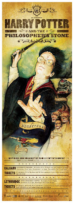
Harry Potter

Harry Potter program cover

I was asked to produce a poster and program booklet, among other things, for an Alberta Dance Theatre production of Harry Potter. The only request was that it look nothing like the existing books or the movie. I think it turned out quite well. Above is the program cover.

Harry Potter program back cover

The back of the program features the invitation letter that Harry received from Hogwarts School of Witchcraft and Wizardry.

Harry Potter poster

The final poster. It all started with an idea to make a circus poster.

Wednesday, December 16, 2009

Oscar Party Invitation

Oscar party invitation

This was a poster invitation to an Oscar-themed fundraising party held every year by Theatre Calgary. I had suggested a full 27 x 40 poster featuring a full size Oscar statuette but, when finances were established, concessions had to be made and we decided on an 11x17 that highlighted the statuette's torso.

The poster is comprised of movie quotes (thank goodness for imdb.com). I researched all of the quotes and typeset the piece.

The quotes are not all Oscar winners, or necessarily Oscar nominated films, but they were films I wanted to use, plus a few special requests from the client. A quote from each Marx Brothers movie was a must, as was the "Take your stinking paws off me" line from Planet of the Apes. The poster was very well received.

Tuesday, December 15, 2009

High Fidelity


A make-work project for myself that ties into my appreciation of movie posters. Since high resolution images of John Cusak were not available to me I opted for a more conceptual approach that, I feel, also tied into the novel quite well.

Monday, December 14, 2009

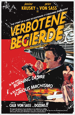
Verbotene Begierde

Verbotene Begierde

A wedding invitation poster that I created for a friend. The title, Verbotene Begierde (German for "forbidden love"), stems from his German heritage and his fiancee's Jewish roots.

He originally wanted a pulp novel cover and I convinced him to do a film noir poster. The title was set in German to give it a foreign noir feel. I did borrow the poses of the bride and groom from two existing noir posters featuring Ava Gardner and Rod Steiger but the heads are of the couple — sort of.

Sunday, December 13, 2009

The Show Off

The Show Off

A poster advertising the "Show Off," which is an exhibition of advertising and design for a southern Alberta awards show called the "Ad Rodeo Anvils" (the award is shaped like an anvil).
The theme was "Flex your design muscle" and I opted for my pop culture roots. This piece won an anvil award for the best use of illustration and an award of merit for best poster in that year's award show.

Saturday, December 12, 2009

Fresh

Fresh

A bus shelter poster design for a local clothing boutique.

Friday, December 11, 2009

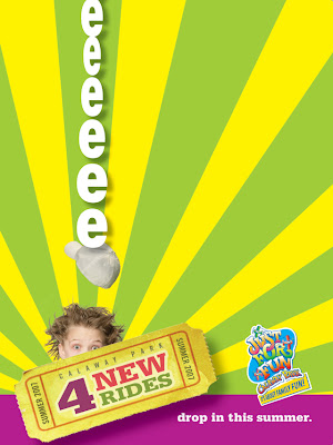
Aaaaaaaa-eeeeee!

Aaaaaaaa!

eeeeee!

Both of these ads were given to me as a concept pencil sketches for a Calaway Park advertising campaign. I created all of the final art for the printed pieces.

Thursday, December 10, 2009

Please Slow Down

Please Slow Down

Each year, because of all of the construction throughout the city, more and more road workers for The City of Calgary were getting injured by frustrated drivers speeding through construction zones.

The City of Calgary wanted an effective road side campaign that would slow down drivers while going through construction zones. A similar campaign had been started in the United States that utilized an orange construction sign that featured child-like type, complete with backward "Rs". We wanted something stronger.

So I got to develop a campaign that made people aware that the City workers were like everyone else, and that they too had family to go home to. This effective campaign ran for over two years.

Wednesday, December 9, 2009

CAPP


A statistical report on the oil sands for the Canadian Association of Petroleum Producers.

Tuesday, December 8, 2009

Publications Unbound


Logo design for a web company that supplied pdf travel pages that people could simply download and read off their palm pilot so that you could hold a library in the palm of your hand.

Monday, December 7, 2009

Orthodontics logo

Orthodontics logo

The only real restriction for this logo was that the client wanted to use the word Surrideo — Latin for smile.

The use of traffic signs to represent corrective orthodontic work was well received and unlike any other orthodontic clinic.

Sunday, December 6, 2009

Public Art Program Logo

Public Art Program Logo

A sculpture, located in downtown Calgary, called "The Conversation" seemed an obvious choice to symbolize the Public Art Program. Because, with art there is usually discussion.

Tuesday, December 1, 2009

Resume


Click the image to enlarge.