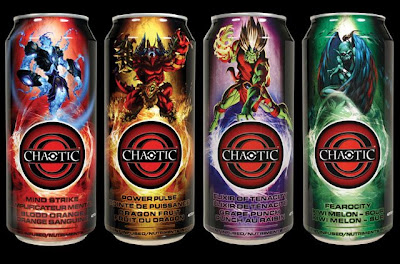
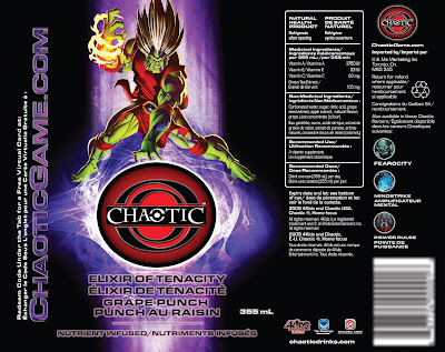
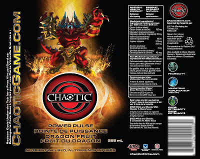
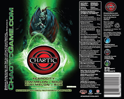
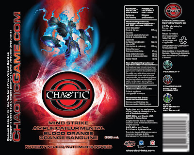
A new product is being introduced to Canadian consumers. It's already in the United States and the distributors wanted the cans to look different than their U.S. counterparts. The elements provided were the key art for the character cards, the drink names and the Chaotic logo.
Rather than showing the environment the characters occupy on the cards, I decided to cut them out and have them shown at the stage of transporting into the world of Chaotic with a glowing logo beneath them. The effect is quite striking when printed against a rich black background.


No comments:
Post a Comment